Friday 29 May 2015

FMP: Diamonds on the Soles of her Shoes


"People say she's crazy, she's got diamonds on the soles of her shoes, well that's one way to lose these walking blues, diamonds on the soles of her shoes..."

Her is one of my four final pieces for my FMP. This is probably the picture I am most happy with, I feel the composition and the colours work well together.

The idea behind this image was that the 'poor boy' was looking up at the 'rich girl' from his home in South Africa where he was a diamond miner. This is both a reference to lyrics in the song and the blood diamond fiasco that happened around the time that the album was made (which some people believe the song has made reference to). He is looking up to her lovingly, as she is almost unattainable because they come from two different worlds.

The 'rich girl' sits almost on top of the world as she is perched about New York, specifically Broadway, which shows a number of different buildings including theatres, dancehalls and bodegas (a bodega is a small supermarket!). These two worlds have been separated by water, which features in all of the images. As the girl looks down, we see her focused on two characters, who are actually her and the 'poor boy' who find love against the odds and end up 'sleeping in a doorway' together.

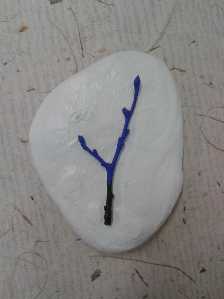
The idea for the landscapes of these islands was that they were a bit whimsical and fantastical, hence water cascading down into the abyss and mountains with faces and features. The colour palette was taken from the earthiness and tribal-like twigs I painted for my promotional materials.

I am not 100% happy with the final outcomes for my pieces, but I think they express a personal representation of each song from the album, interlaced with the ideals of others' accounts as well. It is hard to decipher a song accurately unless you have the lyricist telling you the meaning! All songs mean different things to different people, it is up to you to pick out the elements that you want to understand or create a narrative from. The idea behind these illustrations is that it just gives you a starting point, and you can go from there...


Personal: Commission

I was asked recently to produce a logo for a client who was embarking on a walking performance piece to challenge the way we interact with strangers and also to discuss energy sources. She will be carrying 50 light bulbs with her as she walks. 
She has a very clear idea in her head of how she wanted the logo to look so it was a pretty simple process to get to a final design from her reference materials and instruction.


The idea was that she wanted the inside of the light bulb to be the 'GO' walking man from traffic lights. Other versions of this showed just the outline of the figure, so it looked more like wire, but she settled on the filled version at the final image.

She then enquired about a rubber stamp. Thankfully, I had recently been inducted on how to set up an image ready for lasercutting, so was able to take the image into Illustrator and then create a final stamp for her.


I then packaged it with one of my new stickers from the promotional materials project!! First time I could put them to proper use!


Tuesday 26 May 2015

FMP: Colour

Here are a few photos of my starting to colour my final pieces...


FMP: Snippets

For my Final Major Project, I created four A2 illustrated storytelling maps depicting four of the best known songs from Paul Simon's icon 1986 album, 'Graceland', as a celebration for the 30th anniversary next year.

Here are some snaps of some WIPs from the project...
(sketchbook work to follow)


Project: Promotional Materials

Here are some final designs for my promotional materials.

I created a logo to use for a rubber stamp -


which I then used to make 'found paper' business cards out of scrap pieces of paper I found!


I also used it to make badges, along with some existing pictures I'd drawn for the previous D&AD project.


I also painted stones for my CV which turned out to be quite cool!

These will be photographed in formation to make sense!
I also made packaging for my badges and some pencils I had made...


Wednesday 6 May 2015

Project: Promotional Materials

We're coming towards the end of the project now and things are, slowly, starting to take shape with my promotional materials.

I have decided to use stones as they are one of my favourite things to paint on, but also use painted
twigs as well.

The colours used for my promotional materials are the colours I will use for my final major project too, which is a series of paintings using a limited colour palette.

The first stone I painted was with the intention of using it for a business card. I have experimented with a few different possibilities of how it may look but haven't settled on one idea yet..


Embedded image permalinkEmbedded image permalink

Embedded image permalink

Embedded image permalink

I also experimented with using stones to create a CV that would then be photographed, much like I intent to do with the business cards.

Embedded image permalink  Embedded image permalink

Embedded image permalink

I like the idea of photographing it against a bold background - using one of the other colours from my final colour palette.

I then, also, experimented with painting bottles!! These would be nice to photograph for postcards etc. but also they are perfect for holding my painted twigs!

Embedded image permalink Embedded image permalink

 Embedded image permalink

Also.... the best little painted twig got it's own mini photo shoot, just for being so damn cute!


Embedded image permalink