Showing posts with label uni work. Show all posts

Thursday, 22 October 2015

Uni: Post for Neil

Having graduating from art college, you kind of feel like you can't send your old tutors regular post...


(there was bunting inside!)

Saturday, 6 June 2015

FMP: Graceland


"And my travelling companion is nine years old, he is the child of my first marriage, and I have reason to believe we both will be received in Graceland..."

Graceland is the title track from the album so I thought it would be foolish not to make a storytelling map for it! Paul Simon describes the song as a 'country travelling song', inspired by the musicians he met whilst working in South Africa, but there is also an underlying story of love and loss which I found to be very important within the story of the lyrics. Although never formally mentioned, the song suggests that the narrator has been through a recent breakup with his wife and is extremely heartbroken. This leads to the idyllic ideals that Graceland will be all receiving and that he should travel there with his nine year old son.

I wanted to convey this feeling of moving away from loss and into a happier place. The right hand side of the map is bare and lifeless, as if to represent the emptiness in his life. But he and his son are moving onwards to the left of the map which is full of crops and trees and people and bountifulness, conveying the richness of life he hopes to receive when reaching Graceland. I liked the idea of Graceland not just being the home of Elvis, but also this amazingly fantastical funland which was dedicated to the King himself!

Whilst this is all unfolding on the earth below, the ex-wife looks on brushing 'her hair from the forehead'. I wanted the perspective of the story to be seen almost through her eyes as, even though she isn't even named in the song, she plays a very important role in the emotions of the song.

Other elements from the lyrics have been picked up such as 'the Mississippi Delta', 'the civil war', 'pilgrims', 'the wind blows' and, in the background, 'there is a girl in New York City who calls herself the human trampoline...' The space of the island itself is Tennessee.


Friday, 29 May 2015

FMP: Diamonds on the Soles of her Shoes


"People say she's crazy, she's got diamonds on the soles of her shoes, well that's one way to lose these walking blues, diamonds on the soles of her shoes..."

Her is one of my four final pieces for my FMP. This is probably the picture I am most happy with, I feel the composition and the colours work well together.

The idea behind this image was that the 'poor boy' was looking up at the 'rich girl' from his home in South Africa where he was a diamond miner. This is both a reference to lyrics in the song and the blood diamond fiasco that happened around the time that the album was made (which some people believe the song has made reference to). He is looking up to her lovingly, as she is almost unattainable because they come from two different worlds.

The 'rich girl' sits almost on top of the world as she is perched about New York, specifically Broadway, which shows a number of different buildings including theatres, dancehalls and bodegas (a bodega is a small supermarket!). These two worlds have been separated by water, which features in all of the images. As the girl looks down, we see her focused on two characters, who are actually her and the 'poor boy' who find love against the odds and end up 'sleeping in a doorway' together.

The idea for the landscapes of these islands was that they were a bit whimsical and fantastical, hence water cascading down into the abyss and mountains with faces and features. The colour palette was taken from the earthiness and tribal-like twigs I painted for my promotional materials.

I am not 100% happy with the final outcomes for my pieces, but I think they express a personal representation of each song from the album, interlaced with the ideals of others' accounts as well. It is hard to decipher a song accurately unless you have the lyricist telling you the meaning! All songs mean different things to different people, it is up to you to pick out the elements that you want to understand or create a narrative from. The idea behind these illustrations is that it just gives you a starting point, and you can go from there...


Tuesday, 26 May 2015

FMP: Colour

Here are a few photos of my starting to colour my final pieces...


FMP: Snippets

For my Final Major Project, I created four A2 illustrated storytelling maps depicting four of the best known songs from Paul Simon's icon 1986 album, 'Graceland', as a celebration for the 30th anniversary next year.

Here are some snaps of some WIPs from the project...
(sketchbook work to follow)


Project: Promotional Materials

Here are some final designs for my promotional materials.

I created a logo to use for a rubber stamp -


which I then used to make 'found paper' business cards out of scrap pieces of paper I found!


I also used it to make badges, along with some existing pictures I'd drawn for the previous D&AD project.


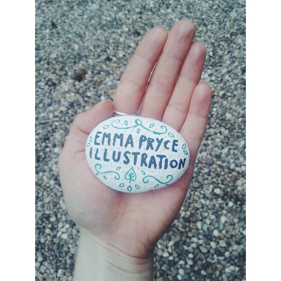
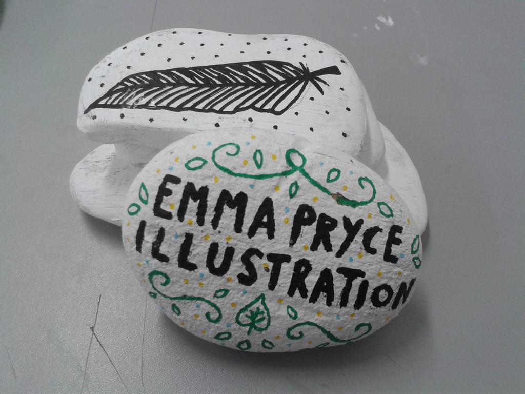
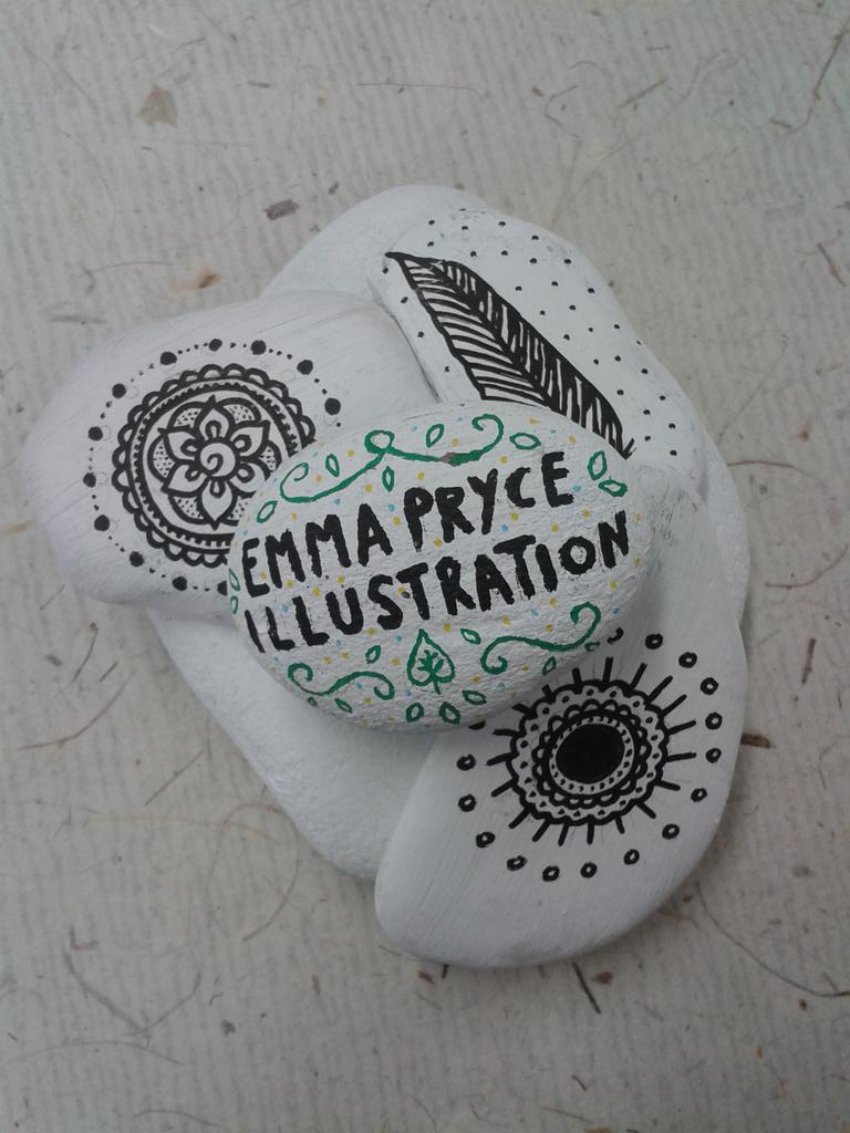
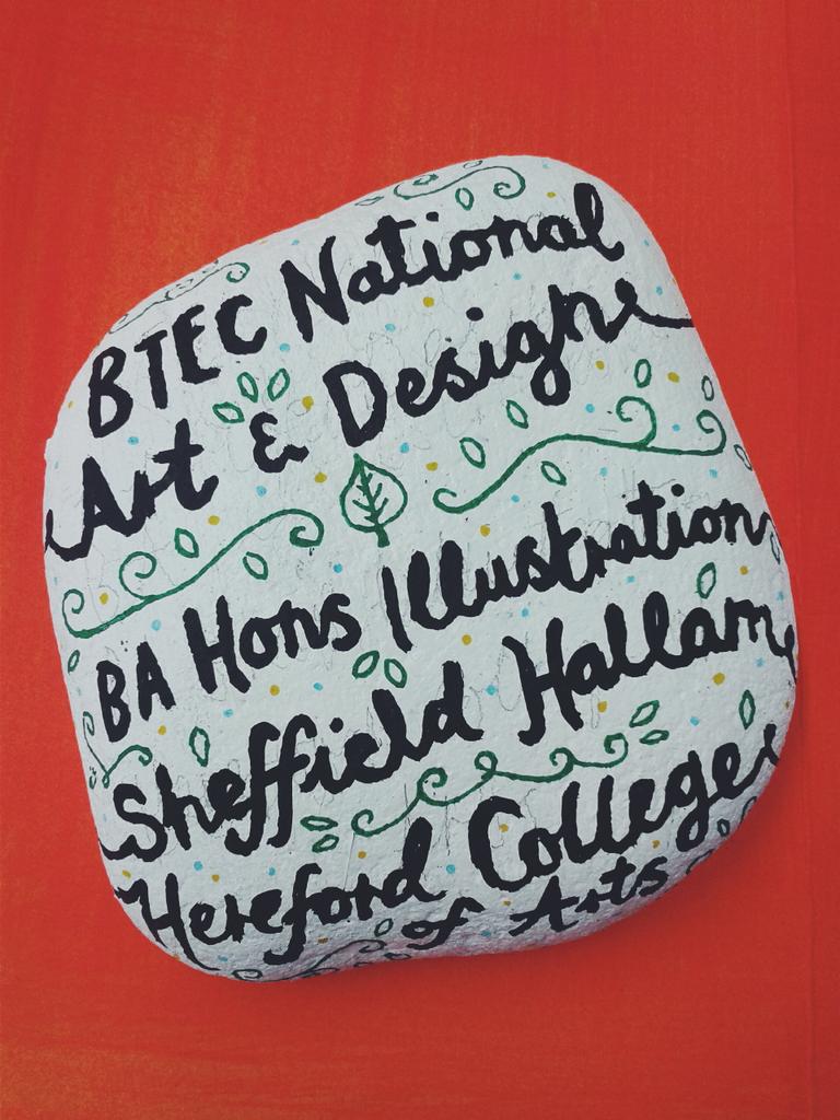
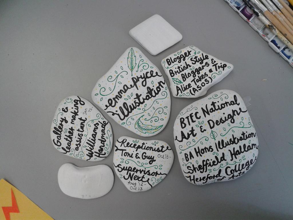
I also painted stones for my CV which turned out to be quite cool!

These will be photographed in formation to make sense!
I also made packaging for my badges and some pencils I had made...


Wednesday, 6 May 2015

Project: Promotional Materials

We're coming towards the end of the project now and things are, slowly, starting to take shape with my promotional materials.

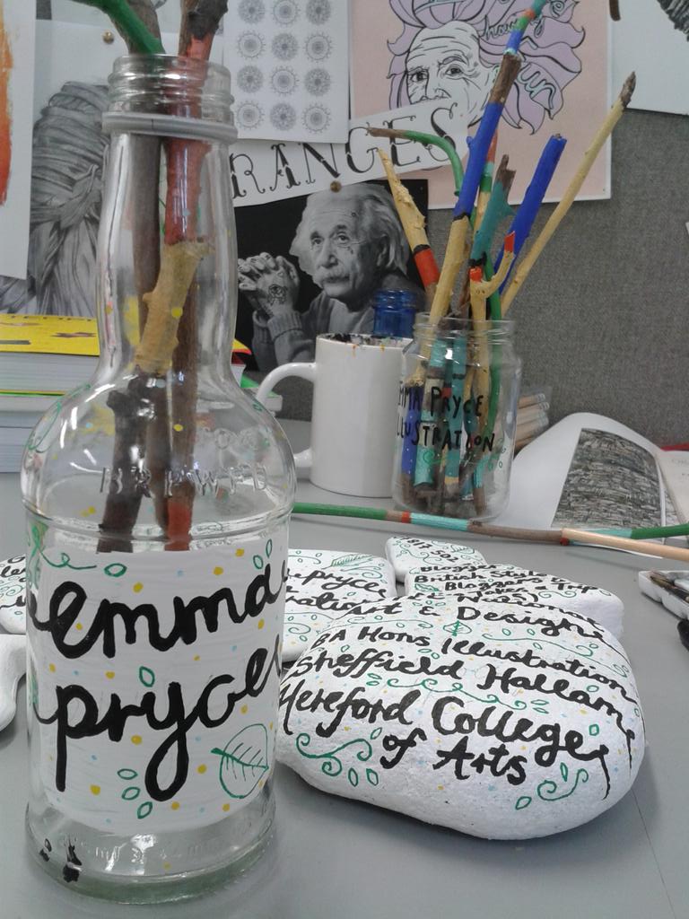
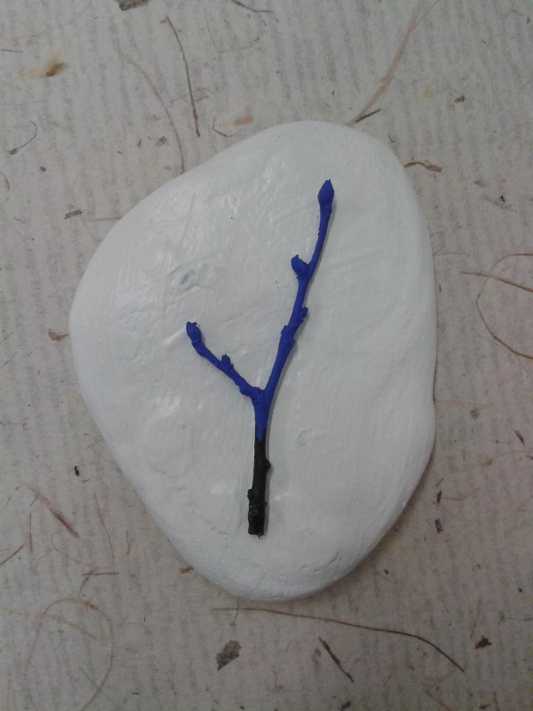
I have decided to use stones as they are one of my favourite things to paint on, but also use painted
twigs as well.

The colours used for my promotional materials are the colours I will use for my final major project too, which is a series of paintings using a limited colour palette.

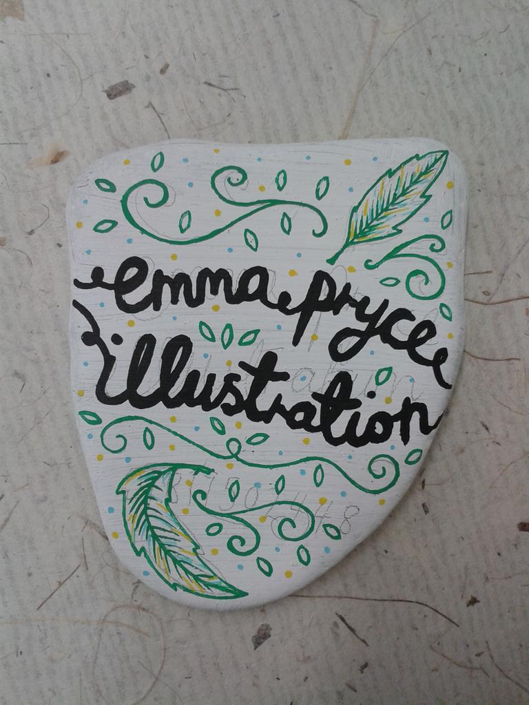
The first stone I painted was with the intention of using it for a business card. I have experimented with a few different possibilities of how it may look but haven't settled on one idea yet..


Embedded image permalinkEmbedded image permalink

Embedded image permalink

Embedded image permalink

I also experimented with using stones to create a CV that would then be photographed, much like I intent to do with the business cards.

Embedded image permalink  Embedded image permalink

Embedded image permalink

I like the idea of photographing it against a bold background - using one of the other colours from my final colour palette.

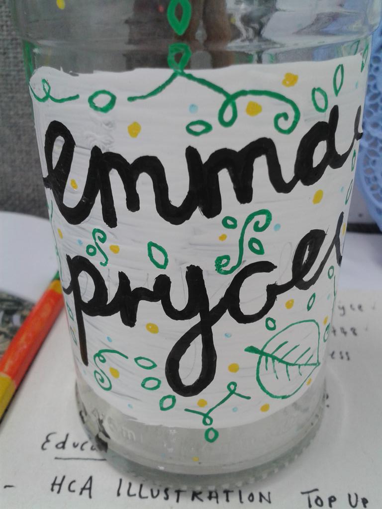
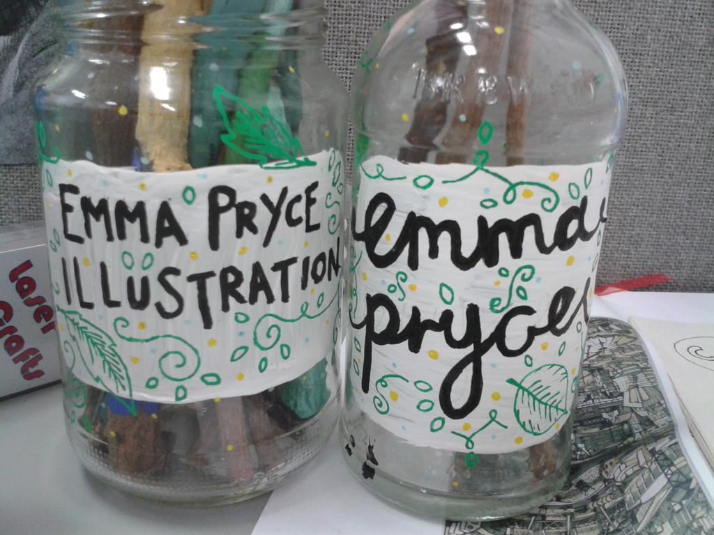
I then, also, experimented with painting bottles!! These would be nice to photograph for postcards etc. but also they are perfect for holding my painted twigs!

Embedded image permalink Embedded image permalink

 Embedded image permalink

Also.... the best little painted twig got it's own mini photo shoot, just for being so damn cute!


Embedded image permalink 


Tuesday, 28 April 2015

Project: D&AD Awards - Future You

One half of the Future You project was to create a digital image to represent yourself in 10 years time.

I developed the idea of me just being a massive hippy!!! But covered in the tattoos from the previous post.

The idea is that I am not necessary physically covered head to toe in tattoos, but more the symbolism of what each tattoo symbolises and the person I have become throughout the journey of getting them/creating them/doing them/achieving these goals.


I quickly compiled some ideas with my very, very limited Photoshop knowledge!!


I then ran out of time! But compiled this image using the coloured in tattoos from the final flash sheet with the intention of colouring it in digitally.


I thought I could use this for promotional materials. 

Project: D&AD Awards - Future You

I have been asked to do an extra module to help make up marks for my Professional Practice module from the second year.

The brief stated that we were to imagine ourselves in 10 years time - what would we be? who would we be? what would our world be like? and then produce both a digital and printed image of our outcomes.


I experimented with some outcomes and settled on the idea that I would be covered in tattoos, each one representing an achievement or a goal that I wish to have achieved in the next ten years i.e. graduate from uni with a masters, live on a houseboat along with some more humorous ones (like being a spinster!)


I made a flash sheet of these tattoos by planning out what each one was going to look like, hand drawing them and then scanning them into Photoshop to arrange into a flash sheet. I then printed this off and hand coloured the images with pencil crayons to give it that American Traditional painted affect without actually having to paint it!
 

Meanings of each of the tattoos :

1. Beetroot/ Carrot - the idea that in 10 years time I will hopefully be completely vegetarian, or maybe even vegan!
2. Spinster - I'M GOING TO DIE ALONE!!!!!
3. Goat/Chicken - I want to live self-sufficiently and have pets (obviously I will only drink the goat's milk and eat the eggs if I'm not vegan!)
4. Hand with Pencil - Hopefully I will be a successful illustrator.
5. Graduation - I would love to have done a MA within the next 10 years.
6. Born Free - The thought that I will be a free spirit and have enough money and time to travel and go where I please, which leads me onto....
7. The Globe - I'M GOING TO TRAVEL THE WORLD! (or maybe conquer it!)
8. Peace - Hopefully my illustrations can be used for good! Like charity and political activism. So Don't Hate, Illustrate.
9. Boat - For years, I want to live in a bus, but that has altered to wanting to live in a house boat, on the canal, just free to draw and come and go as I please. In peace. Alone....
10. Plants - I want a vegetable garden and a roof garden on my boat!!
11. India - I love India and Indian culture. I have never travelled there but hope to visit. I also sponsor a child who lives in Sri Lanka, so I would like to visit there often too to see her progress.
12. Om - See abovc ^^^ :-)
The rest are just little fillers!!


Friday, 20 March 2015

Project: FMP Ideas

So, it's come round very quickly but I am now doing my final major project at uni! It's all going too fast.

I had an original idea of doing my project about symbology throughout culture and religion (this idea has since changed and I will write about it another time!!) and was struggling to think of anything to draw...

So I drew some sadhus instead!


Sadhus are Hindu men or women who live a life away from the rest of society to focus on their path to enlightenment through faith. They usually have painted faces and long dreadlocks, making them incredibly interesting to draw.

Even though I won't be using these images for my final project, I would love to produce some more paintings/drawings like these.

Tuesday, 27 January 2015

Research: Dissertation

Today I did some work on my dissertation. It's slowly getting there! It's so interesting reading up about Land Girls and their experiences during their time helping the war effort. Some of the accounts are actually pretty emotional and overwhelming. Basically my dissertation is just an excuse to say THANKYOU to them for being so awesome and help path the way to equality for women.

Today I was specifically looking at WWI recruitment posters and how they portrayed the Women's Land Army in an idyllic and, almost, glamorised manner, using patriotic sayings and suggestions to encourage women to sign up.


Tuesday, 20 January 2015

Project: MOO/YCN Brief

The MOO project proved to be quite difficult to make what I had pictured in my head into a final piece. I gathered different materials, such as paint brushes, paper clips and buttons, to use as a collage to make a machine that would portray the slogan DESIGN WONDERS WONDERS.


I originally wanted to make a steampunk style machine as I love the style and worn look. However, MOO have quite a particular illustrative style and colour scheme that they wanted to use so, to keep true to the brief, I had to alter the design style entirely.


I started with a pile of materials.


From there I experimented with creating a suitable background as a basis for the design. MOO have quite simple and colourful graphics that they like to use to promote their company so during my experimentation, I had to change some of my initial designs as they seemed to be too fussy.


I played around with the idea of using buttons as cogs, but it didn't reflect as well as I hoped it would. I decided to incorporate some illustrative sections within the design to make the buttons appear more 'cog like!' I used the MOO style to do this.


I found this style of cog worked a lot better.


I then experimented with making little arms for my machine!! I used a combination of illustration and collage again to do this.


The next point was trying to build the machine up and see how it would work it's way up the page.


As I experimented more, it seemed to take shape.


With the strong colours and the bold illustrative style, the machine seems to be getting closer to the initial outlines of the brief.