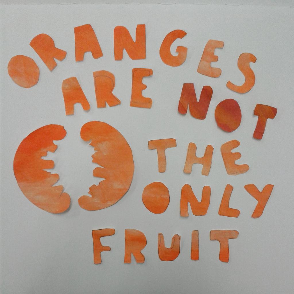
The MOO project proved to be quite difficult to make what I had pictured in my head into a final piece. I gathered different materials, such as paint brushes, paper clips and buttons, to use as a collage to make a machine that would portray the slogan DESIGN WONDERS WONDERS.
I originally wanted to make a steampunk style machine as I love the style and worn look. However, MOO have quite a particular illustrative style and colour scheme that they wanted to use so, to keep true to the brief, I had to alter the design style entirely.

I started with a pile of materials.

From there I experimented with creating a suitable background as a basis for the design. MOO have quite simple and colourful graphics that they like to use to promote their company so during my experimentation, I had to change some of my initial designs as they seemed to be too fussy.


I played around with the idea of using buttons as cogs, but it didn't reflect as well as I hoped it would. I decided to incorporate some illustrative sections within the design to make the buttons appear more 'cog like!' I used the MOO style to do this.


I found this style of cog worked a lot better.
I then experimented with making little arms for my machine!! I used a combination of illustration and collage again to do this.


The next point was trying to build the machine up and see how it would work it's way up the page.


As I experimented more, it seemed to take shape.

With the strong colours and the bold illustrative style, the machine seems to be getting closer to the initial outlines of the brief.
I originally wanted to make a steampunk style machine as I love the style and worn look. However, MOO have quite a particular illustrative style and colour scheme that they wanted to use so, to keep true to the brief, I had to alter the design style entirely.
I started with a pile of materials.
From there I experimented with creating a suitable background as a basis for the design. MOO have quite simple and colourful graphics that they like to use to promote their company so during my experimentation, I had to change some of my initial designs as they seemed to be too fussy.
I played around with the idea of using buttons as cogs, but it didn't reflect as well as I hoped it would. I decided to incorporate some illustrative sections within the design to make the buttons appear more 'cog like!' I used the MOO style to do this.
I found this style of cog worked a lot better.
I then experimented with making little arms for my machine!! I used a combination of illustration and collage again to do this.
The next point was trying to build the machine up and see how it would work it's way up the page.
As I experimented more, it seemed to take shape.
With the strong colours and the bold illustrative style, the machine seems to be getting closer to the initial outlines of the brief.